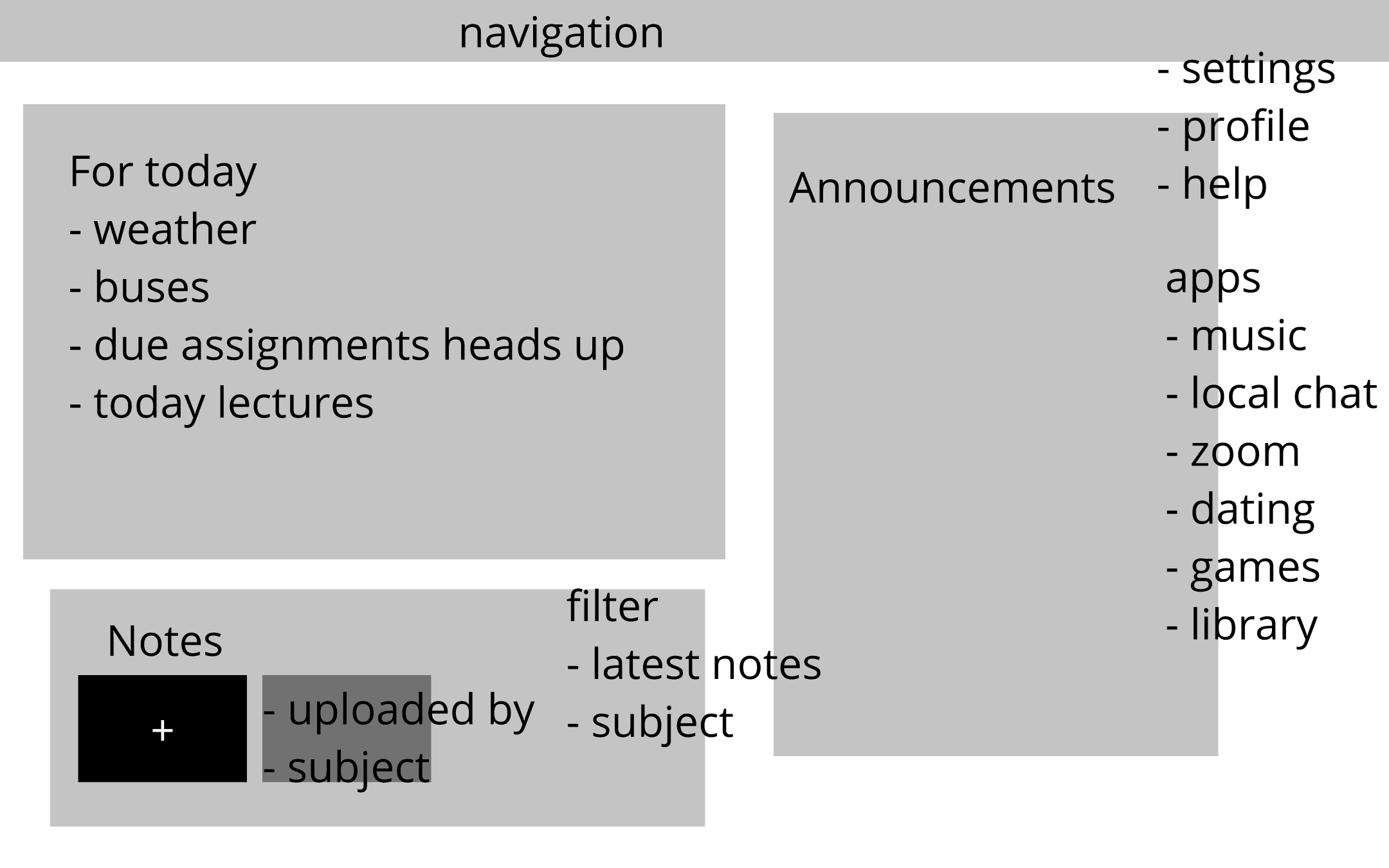
LAYOUT
3-Column Hierarchy
Information is sorted for easier access and digestion - urgent left to secondary right. The layout is the navigation. No tabs, no clicks, no menus.
ACCENTS
Active Highlight
Relative time over dates to trigger action not just awareness. This small detain gives clarity and acts as an urgency framed deadline.
COPY
"In 6 Hours"
Light pink accent on current or upcoming class removes "where should I be" question entirely. It also adds to aesthetic and hierarchy.
COLOUR
Intentional Dark Mode
Dark interface reduces eye fatigue and strain. Students can check their dashboard any time of day or night. The added aesthetic speaks modern.
future thinking
LIVE APIs
Alerts Via Live APIs
Integrate live OC Transpo data with weather severity (Snow/Ice = add 10 mins walk) and time to next class to push alerts.
PAIRED RESPONSIVE VIEW
Mobile-First View
The dashboard was designed for desktop (Primarily used by students) - a natural choice for study. But glancing at information on phone especially between classes could be handy.
PERMISSION MODEL FOR NOTES
Collaborative Notes
The option and filter for shared and personal notes with notifications when something is shared by a classmate. Sorting, organizing and real-time edits for the notes panel as a better study aid and collaborative environment.
final design

Algonquin College
Dashboard
UI/UX Project
Student Dashboard • Wireframing


PERSONAL ACADEMIC PROJECT • 2020
Overview & problem
As a student at Algonquin College,I noticed a pattern of scattered information and the need to access different sources or apps for everything. That sparked an idea and designing a dashboard was my answer to that problem.
The goal was to design a single page glanceable dashboard that aggregated all-school critical information with zero cognitive overhead - so students could be ahead of or at least in sync with schedules.
pain points


Hover over any card to reveal the design response